Saturday, April 28, 2012
Thursday, April 12, 2012


Tuesday, April 10, 2012
Portfolio Website Research

http://www.colazionedamichy.it/portfolio/
This portfolio website is very clean and interesting. I like the font choice and the thumbnail images are really large, which is a great way to showcase the work.

This website it maybe a little more cluttered than I would like, but the concept is really creative. He does a good job of showcasing a variety of his work by incorporating technology images. I also love how he incorporated his logo with the "business cards" in the top right.

This website has a much grungier, urban feel. I wouldn't necessarily go with that feel, but I liked it because the site itself was congruent with the style of his work. The navigation is really simple, and the front page is a nice blog style to keep things interesting for viewers.

http://www.estudioagraph.com/eng.html
This website was probably my favorite of all my research. I loved how the work is presented really cleanly and it's really showcased well with the full-page images. The color is really effective as well. I love the alignment of the navigation and the simplicity of the sans serif font choice that is consistent throughout the shop.

http://www.gorillagroup.com/
This website was a little larger in scope because it is for an entire firm, but it is really clean and well-organized. The thumbnail images are really great too - the front page has some featured work, but you can access the rest of it through the "our work" tab. This is a very minimal layout, which is nice.
Thursday, March 15, 2012


Tuesday, March 13, 2012
Tuesday, February 28, 2012


Thursday, February 23, 2012
Art Museum Website Design Research

This website is really clean and simple. It's maybe not as aesthetically pleasing as I would like, but it has a great navigation system and is easy to use.

I liked this museum's website design because it was very aesthetically pleasing. They have good font choices, colors, etc, and their navigation was pretty simple.

The Type Museum also had a nice clean website. The navigation is simple to use and the design of the site is very aesthetically pleasing. I really like the separateness of their logo in the top left.
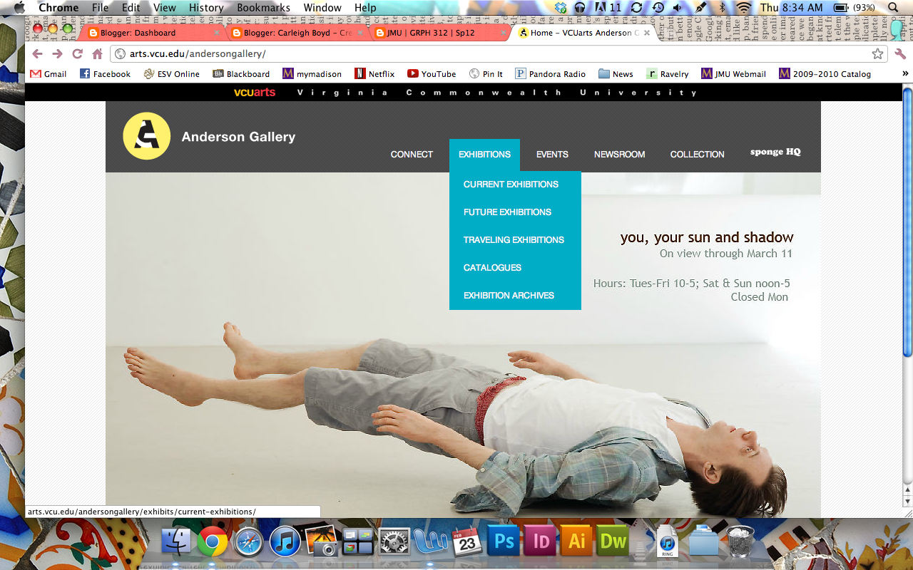
VCU's Anderson Gallery had a really great website. I loved the colors they used and it's very clean and modern. This one is probably my favorite visually.

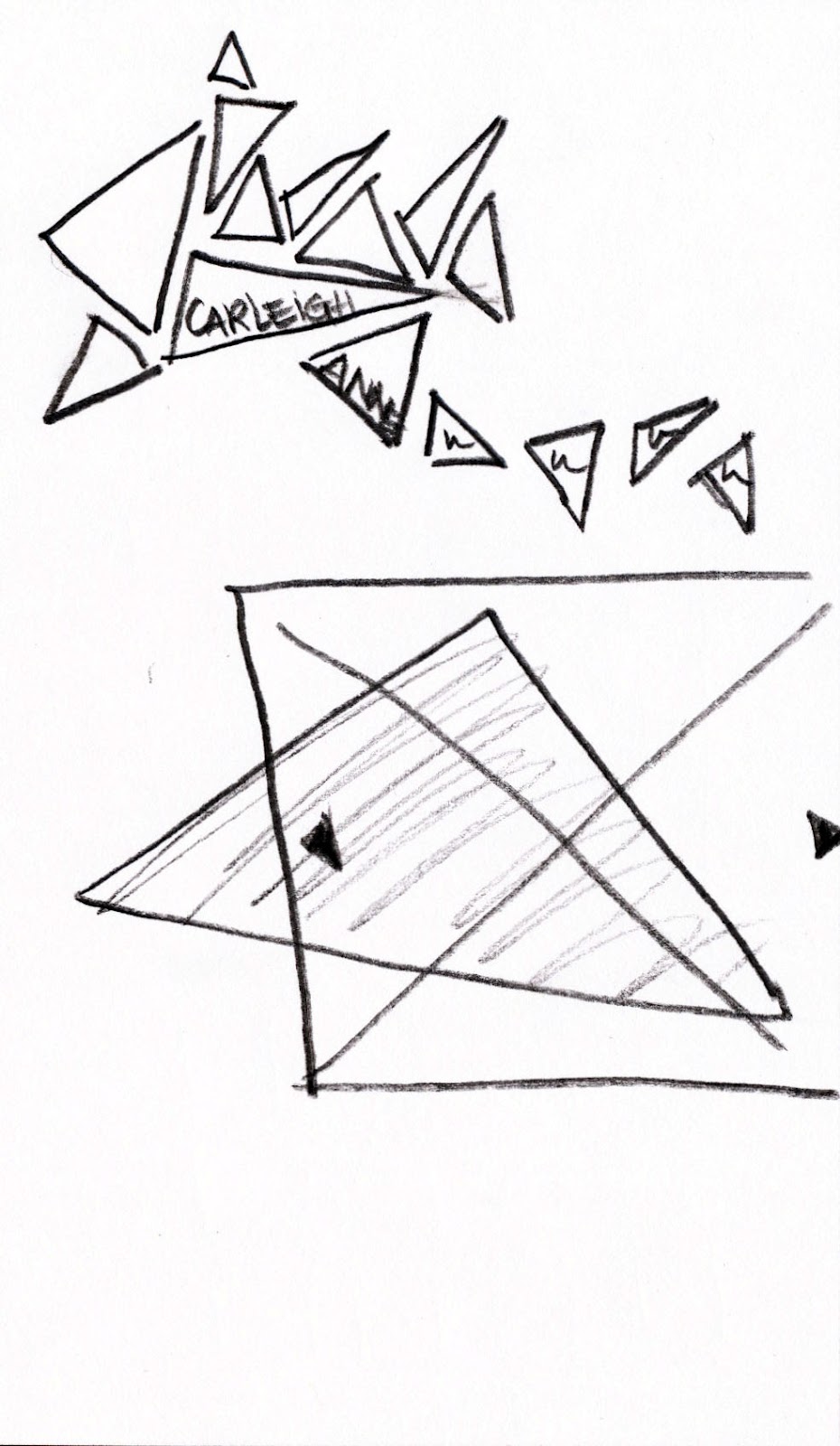
UVA's art museum website isn't as clean as the others, but I really liked the way that they marked their "you are here" navigation with the little triangle jutting down from the current tab.

This website design does a great job of organizing a LOT of information. There's the top navigation for the different Tate galleries (differentiated by colors so you don't get confused), and then there's the internal navigation below that for each.
Tuesday, January 31, 2012


Subscribe to:
Posts (Atom)