
This website is really clean and simple. It's maybe not as aesthetically pleasing as I would like, but it has a great navigation system and is easy to use.

I liked this museum's website design because it was very aesthetically pleasing. They have good font choices, colors, etc, and their navigation was pretty simple.

The Type Museum also had a nice clean website. The navigation is simple to use and the design of the site is very aesthetically pleasing. I really like the separateness of their logo in the top left.
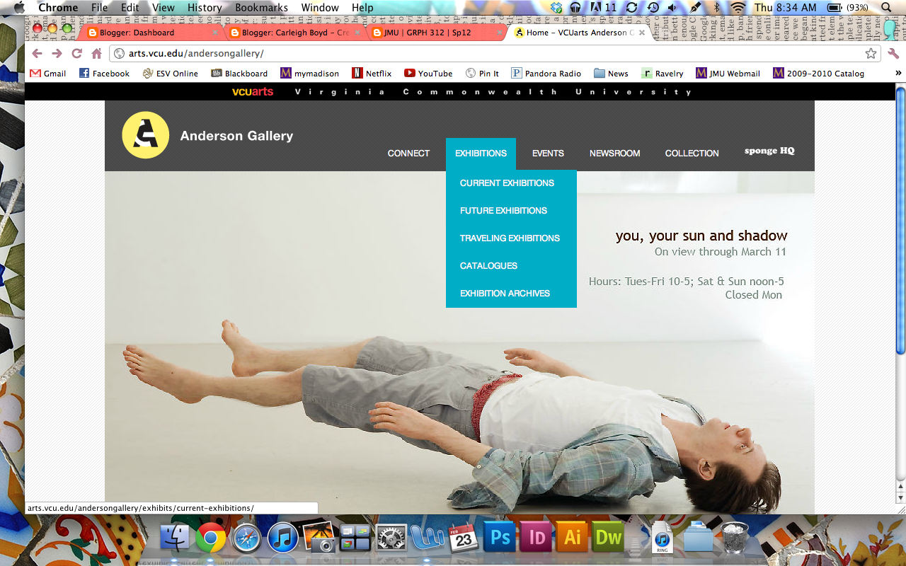
VCU's Anderson Gallery had a really great website. I loved the colors they used and it's very clean and modern. This one is probably my favorite visually.

UVA's art museum website isn't as clean as the others, but I really liked the way that they marked their "you are here" navigation with the little triangle jutting down from the current tab.

This website design does a great job of organizing a LOT of information. There's the top navigation for the different Tate galleries (differentiated by colors so you don't get confused), and then there's the internal navigation below that for each.
No comments:
Post a Comment